Picture this: you’re responsible for frontend architecture across a large organization. Hundreds of active projects. Multiple teams. Different frameworks. Various coding standards.
Now answer these questions:
- Which frameworks are your teams actually using?
- Are they following your tech standards?
- Is your Design System being adopted… or just installed?
- How accessible are your applications?
If you hesitated, you’re not alone. We faced the same challenge at Carrefour. With several hundred frontend projects spread across multiple Digital Factories, we had zero visibility on what was actually happening in the codebase. Every architecture decision was based on assumptions, not data.
We needed to change that.
#📊 Phase 1: Building the Frontend Observatory
#The Idea
We built an automated tool that scans all our GitLab repositories twice a week—no manual reporting, no surveys, just code analysis at scale.
#What We Track
We monitor five key dimensions across every project.
Framework Landscape covers the distribution of frameworks like React, Vue, Angular, and Svelte, along with their meta-framework counterparts (Next.js, Nuxt, SvelteKit) and version compatibility.
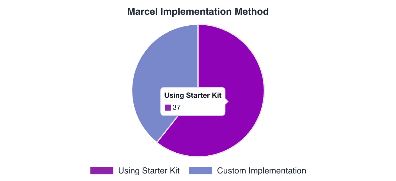
Starter Kit Adoption tracks which teams use our official starter kits, whether they’re on compliant versions, and how this correlates with quality metrics.
Tooling Standards checks for our recommended stack: Renovate for dependency updates, Sonar for code quality, GitLab CI templates, and linting tools like ESLint, Prettier, and Husky.
Tech Radar Compliance ensures projects meet minimum version requirements, flags deprecated technologies, and tracks migration progress over time.
Security Posture pulls vulnerability data from the GitLab Security API, classifies issues by severity, and monitors trends to catch problems before they escalate.
#Benchmarking Against the Market
Raw numbers mean nothing without context, so we compare our tech choices against the annual State of JS survey—the industry reference for frontend trends. This tells us whether we’re aligned with the market, ahead of the curve, or falling behind.
#💡 Key Insight After One Year
One pattern emerged: teams using our starter kits consistently show higher adoption of quality tools and earlier Design System integration.
The starter kit correlates with better standards adoption.
#🎨 Phase 2: Going Deeper with Design System Analysis
#The Problem with “Adoption” Metrics
Most teams measure Design System adoption by tracking npm installs. But installing a package doesn’t mean using it.
We wanted to answer a harder question: Are teams actually using our Design System—called Marcel—in their code?
To find out, we needed to look inside the code itself.
#Enter AST Parsing
AST (Abstract Syntax Tree) parsing lets us read code the way a compiler does—understanding structure, not just matching text patterns.
Unlike regex-based approaches that break on edge cases, AST parsing gives us:
- Accurate component detection across frameworks (React, Vue, Angular)
- Support for different naming conventions (kebab-case
<c-button>, PascalCase<CButton>) - Import statement analysis
- Attribute and prop extraction
We use Tree-sitter as our primary parser, with fallback to regex for edge cases.
#What We Detect
With AST parsing in place, we can extract three categories of data from every project.
#Component Usage
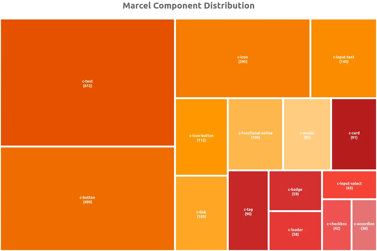
We identify every Marcel component used in the codebase. A typical scan picks up elements like:
<c-button>Submit</c-button>
<c-input-text label="Email" />
<c-modal title="Confirm">...</c-modal>
For each component, we count how many times it appears, analyze usage patterns, and note which variations teams prefer.
#Design Token References
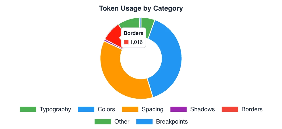
Beyond components, we scan CSS files for design token references:
.my-component {
  color: var(--ds-color-primary);
  padding: var(--ds-spacing-md);
  font-size: var(--ds-font-size-body);
}
This reveals which token categories get the most use—colors, spacing, typography—and flags where teams create custom tokens instead of using standard ones.
#Accessibility Compliance
For each component instance, we examine accessibility attributes:
<c-button aria-label="Submit form">Submit</c-button>
<c-input-text label="Email" aria-describedby="email-hint" />
<c-modal role="dialog" aria-labelledby="modal-title">...</c-modal>
We check for aria-label and aria-describedby presence, proper labeling for form elements, role attributes, and keyboard navigation support. Together, these give us WCAG compliance indicators at the component level.
#The Tech Score
All these metrics feed into a single Tech Score per project—a maturity index that combines:
- Design System adoption rate
- Accessibility compliance
- Token usage consistency
- Best practices adherence
This score makes it easy to identify projects that need attention and track improvement over time.
#🏗️ Technical Architecture
For those interested in the implementation:
┌─────────────────┐     ┌─────────────────┐     ┌─────────────────┐
│  GitLab API     │────▶│  Insight Miner  │────▶│  Insight Hub    │
│  (Source)       │     │  (Analysis)     │     │  (Aggregation)  │
└─────────────────┘     └─────────────────┘     └─────────────────┘
                               │                        │
                               ▼                        ▼
                        ┌─────────────────┐     ┌─────────────────┐
                        │  Tree-sitter    │     │  Chart.js       │
                        │  AST Parsing    │     │  Visualizations │
                        └─────────────────┘     └─────────────────┘
                                                        │
                                                        ▼
                                                ┌─────────────────┐
                                                │  VitePress      │
                                                │  Documentation  │
                                                └─────────────────┘
Key components:
- Insight Miner: Scans GitLab repositories and performs AST analysis on the codebase
- Insight Hub: Aggregates the collected data and generates reports with visualizations
- Insight Pages: Serves interactive documentation built with VitePress
Performance optimizations: The system uses parallel processing with ThreadPoolExecutor and file content caching. We apply smart filtering—skipping files larger than 1MB and performing quick content checks before deeper analysis. Incremental analysis avoids re-processing unchanged code.
#📈 The Output: Auto-Generated Dashboards
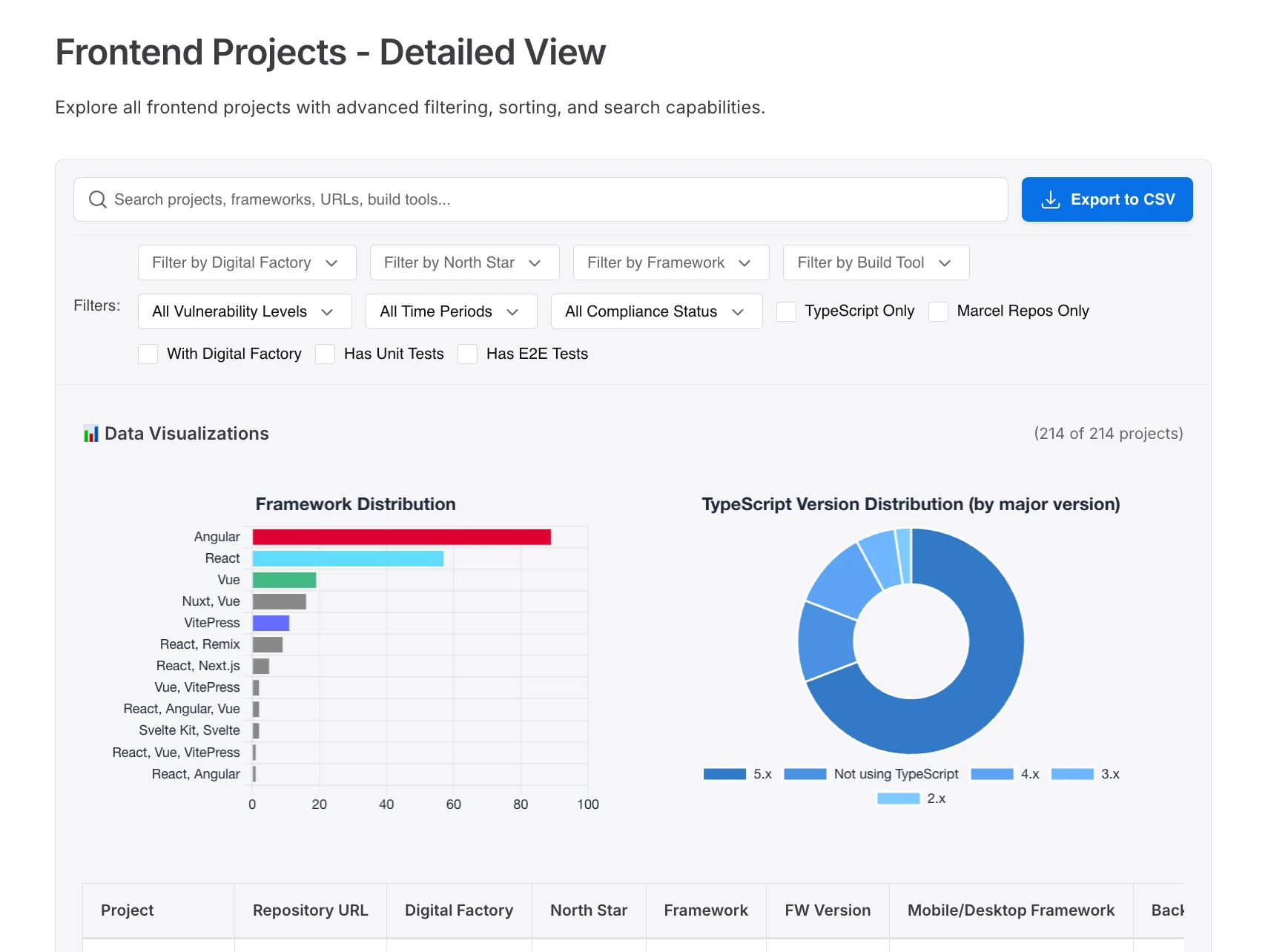
Every scan produces interactive dashboards with charts and visualizations, along with detailed reports broken down by Digital Factory. Each project gets a scorecard with actionable recommendations, plus trend analysis showing how metrics evolve over time.
These dashboards are automatically generated and reviewed in every Digital Factory performance meeting. No manual reporting required.
#🎓 Lessons Learned
Building this system taught us several things.
Measure what matters. npm install counts are vanity metrics—actual component usage in code tells the real story.
Automate everything. Manual reporting doesn’t scale. If it’s not automated, it won’t happen consistently.
Connect to business rhythms. Dashboards reviewed in performance meetings create accountability. Data without visibility is useless.
Start simple, then go deep. We began with basic framework detection; AST parsing came later. Iterate based on what matters most.
Invest in foundations. Starter kits spread standards across teams effectively when done right.
#🔮 What’s Next
We’re now looking at how to expand the system. AI-powered recommendations could suggest specific accessibility fixes. Predictive alerts would flag projects before they drift from standards. We’re exploring cross-project component sharing analysis to identify reuse opportunities, and real-time scanning via CI/CD integration for immediate feedback.
The goal remains the same: replace assumptions with data, and turn that data into action.
Interested in building something similar? Feel free to reach out—happy to share more details about our approach.
A Design System without measurement is a blind investment. With our Frontend Observatory, we now have a 360° view: from the tech ecosystem down to every component and accessibility attribute. If you can't measure it, you can't improve it.
Explore More