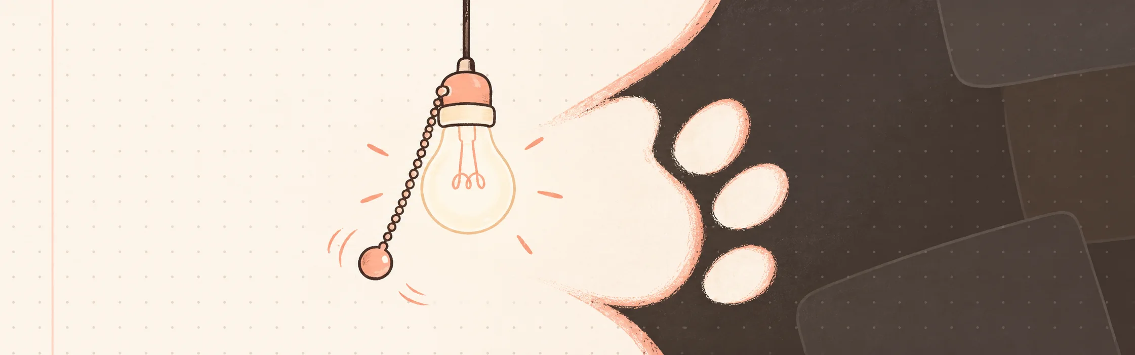


ChaTodo is my task app for ADHD brains. Its dark mode has a light bulb hanging from the header. To switch themes, you pull the chain. Yes, I gave a settings toggle a physics budget.
The chain stretches. The bulb swings. A paw-shaped View Transition spreads the new theme across the page. If sound is on, the chain clicks when it catches. All essential features in a task manager, clearly.
Was it necessary? Of claws.
Under the lampshade#
The chain is a small SVG, redrawn as you pull. Its animation loop runs only while it moves, writing to the SVG directly instead of asking React to render every frame. It pauses when the tab is hidden. A rubber band with better manners.
When the chain catches, document.startViewTransition() captures the old and new themes. The new view appears through an SVG paw mask that grows from the bulb until it covers the farthest corner of the screen. The whole reveal takes 680 milliseconds. Browsers without the API, and people who prefer reduced motion, get an immediate switch. The button also works with a click or the keyboard.
I’m no kitten when it comes to design, so the switch got the full catwalk treatment. I’m irresponsible, not that irresponsible.
Verdict#
Underneath all that theatre is one theme setting. The chain makes me use it twice. I call that a successful interface and absolutely refuse to calculate the engineering hours per pull.
Reasonable decisions can wait for a future stable release — if that day ever comes.
Try it on ChaTodo. Pull the cord once to switch themes. Pull it six more times for quality assurance, obviously.
My users have ADHD. I may have given them a new task: click, night; click, day; click, night. The sound is half the trap. Product-market fit, apparently.