


In this piece
A few months ago I wrote about how we built a 360° Frontend Observatory at Carrefour — scanning hundreds of frontend repos twice a week via AST parsing to measure Marcel adoption, Tech Radar compliance, accessibility, and more.
That post covered the foundation: what we track, how we compute it, why raw npm install counts don’t tell you anything useful. This one is about what we built on top of it.
The problem with global views#
The Observatory gave us a platform-wide picture. Useful for spotting trends, less useful for accountability. When a Tech Manager asks “how is my perimeter doing?”, a 500-project dashboard isn’t the answer.
Two things were missing: a way to drill down to a single project, and a way to scope the whole analysis to a given Digital Factory.

New deliverable #1: the per-project view#
The first addition is straightforward but was the most-requested: each project now has its own page. Before, you could see a project in a table row. Now you can open it, get a full breakdown of its C4 compliance across all six categories, see its framework and dependency tree, track vulnerabilities, and read its Marcel and accessibility scores.
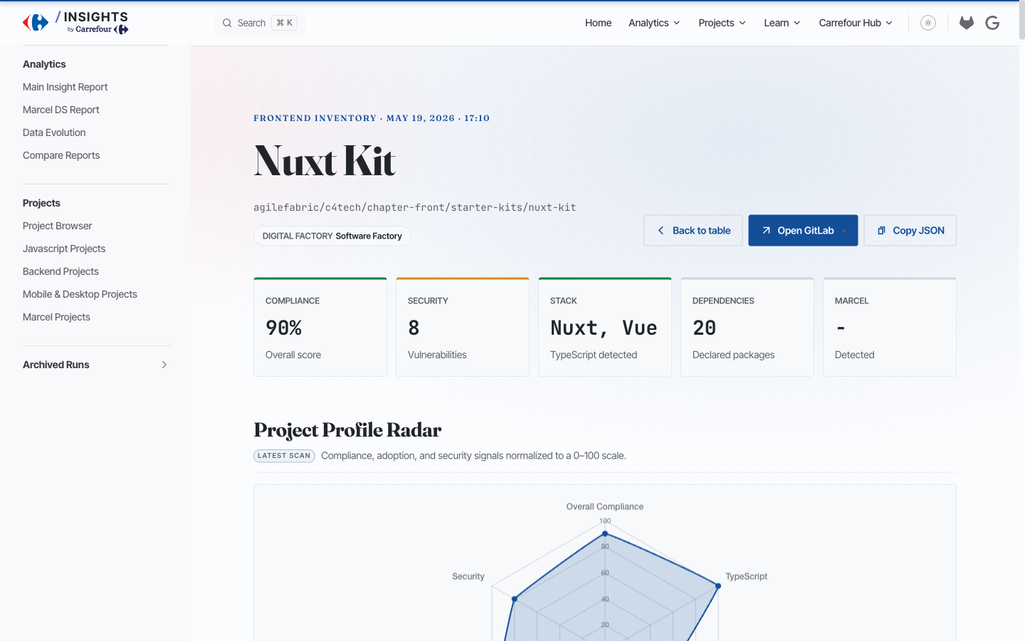
The C4 score breakdown at the project level is fully auditable — every point is explained by the raw project fields, so a team can see exactly what they need to fix to move the needle.
New deliverable #2: auto-generated slideshows per Digital Factory#
This is the more ambitious piece. The idea: each Digital Factory gets its own presentation deck, generated automatically from the latest scan, deployable on GitLab Pages, exportable as PNGs.
The use case is concrete — these decks are used as performance review supports for Tech Managers and CTOs. No prep work, no copy-pasting metrics into slides. The deck is live data.
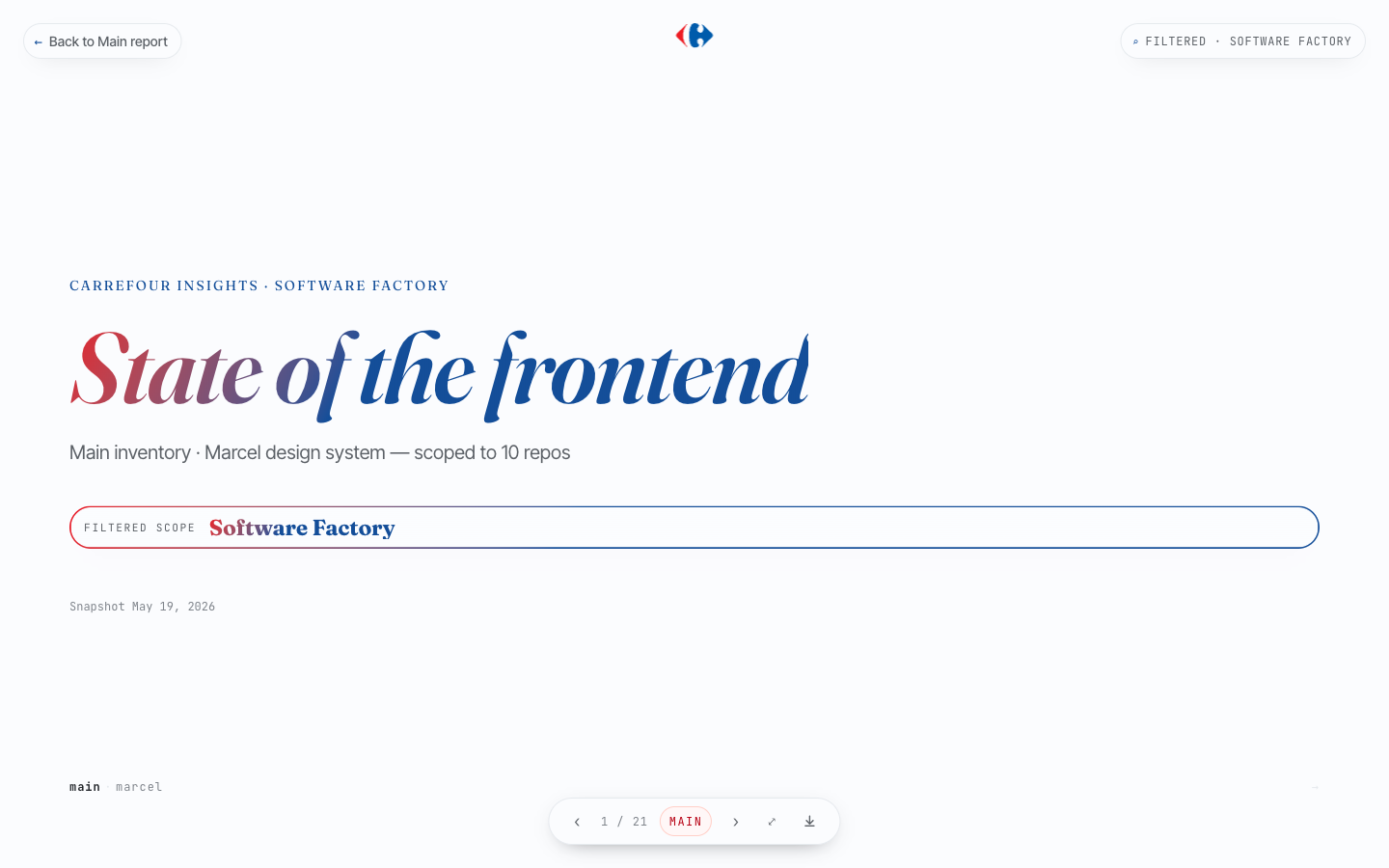
The filter recomputes the entire deck client-side: metrics, charts, Top 3, everything is recalculated for the filtered scope. The FILTERED · SOFTWARE FACTORY badge in the top-right corner confirms the active scope at all times.
What’s inside a deck#
The deck covers two chapters.
Main inventory opens with aggregate metrics — total repos in scope, TypeScript adoption rate with version breakdown, C4 compliance average, testing coverage — followed by chart slides for framework distribution, build tools, and vulnerabilities.
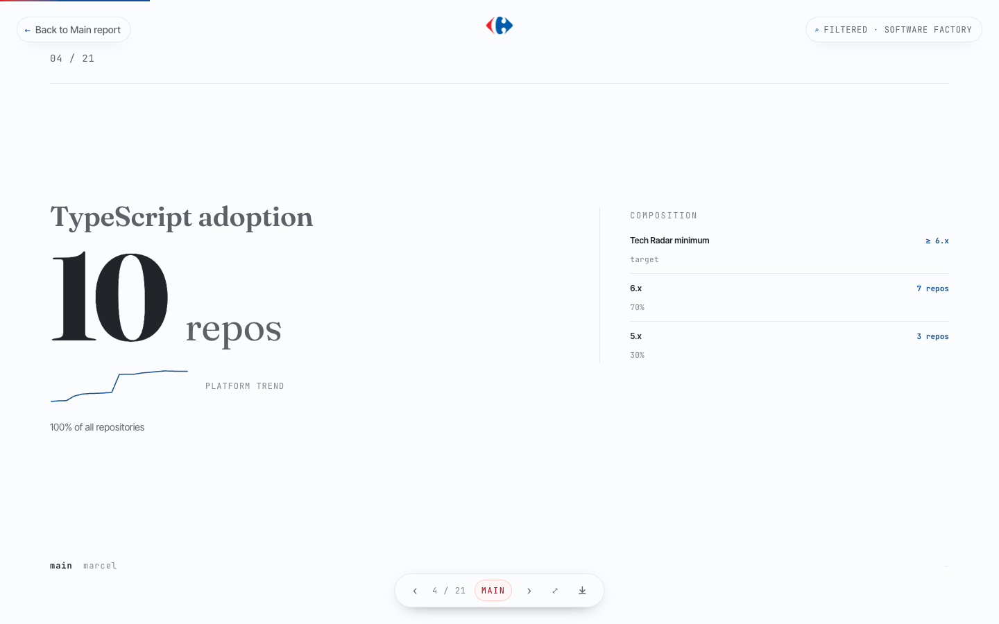
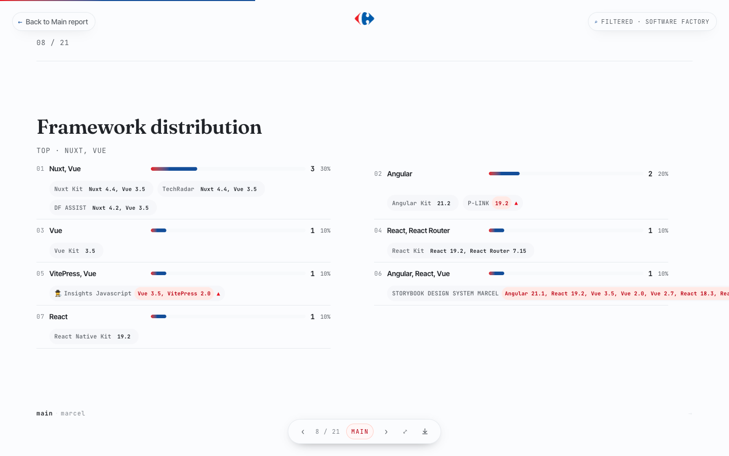
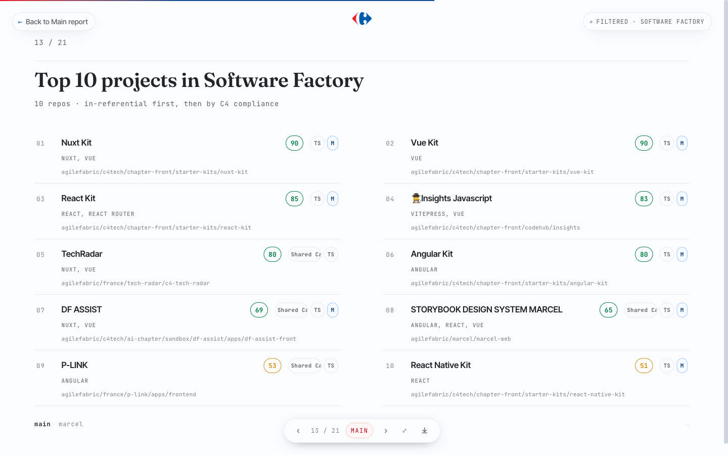
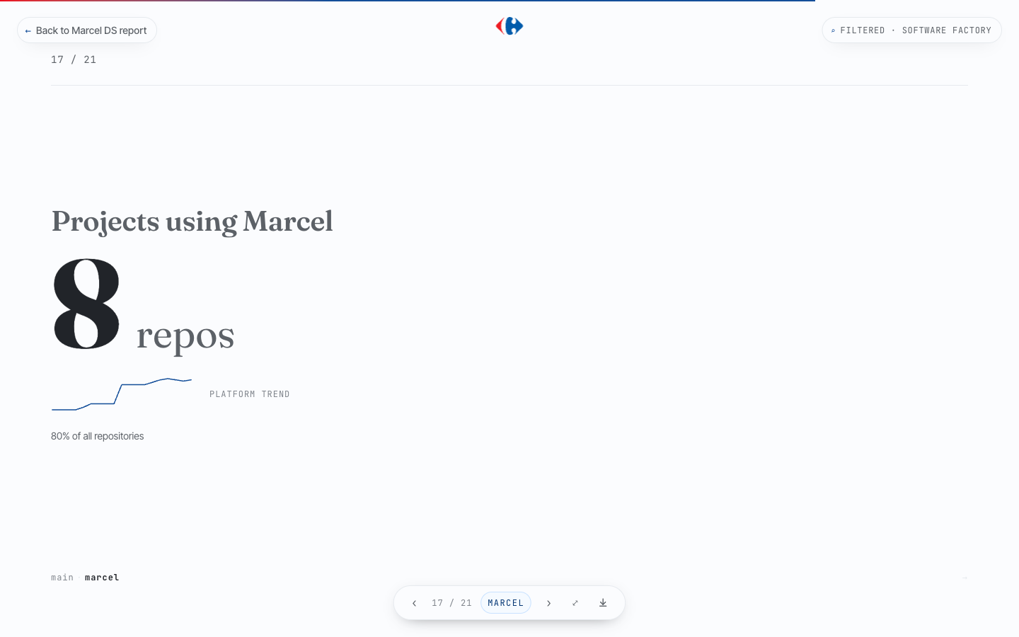
Then come the North Stars and top projects — the two slides that generate the most conversation in review meetings. Marcel design system is the second chapter — adoption rate, component usage breakdown, token distribution by category, and a list of the top Marcel-enabled projects in scope.
The export#
Each deck has a download button that exports all slides as individual PNGs. The intent is simple: Tech Managers can drop them into a presentation or send them in a message without ever touching the tool directly.
A demo walkthrough#
The video below goes through the Software Factory deck from start to finish — filtering, navigating slides, the Marcel chapter, and the export.
What this is part of#
The slideshow and per-project view are the frontend layer of a broader Tech Score initiative we’re building at the Software Factory — a composite measure of technical maturity across GitLab best practices, security posture, AI adoption (code assist), and frontend quality.
The frontend chapter is the one I’m responsible for. The others are coming.
The pattern across all of them is the same: pull data automatically from GitLab, compute scores, surface them where decisions are made. The Tech Score isn’t a dashboard you consult once — it’s a signal that lands in performance reviews, roadmap conversations, and team retrospectives.
Data without distribution is just data.
The tool started as a way to turn raw GitLab data into a readable picture. It's now become the backbone of our frontend performance reviews. The gap between 'we have data' and 'we use data' turned out to be a UX problem as much as a data problem.
Explore More